In Piazza San Marco, Basilica di San Marco and Palazzo Ducale draw all eyes, but its splendor depends on the contribution of the "ground" architectures surrounding Piazza.
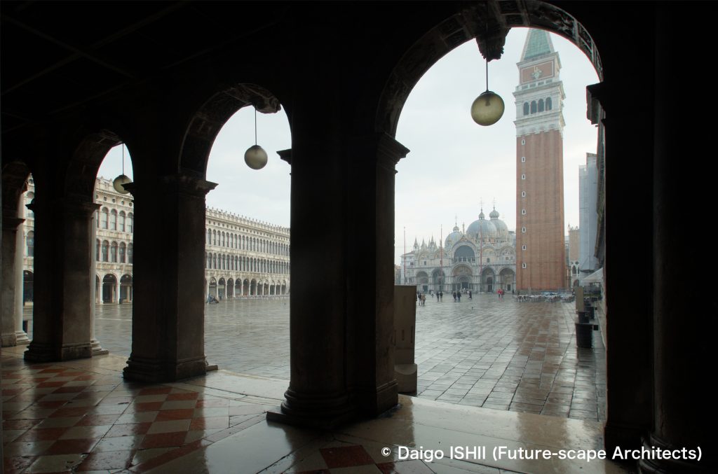
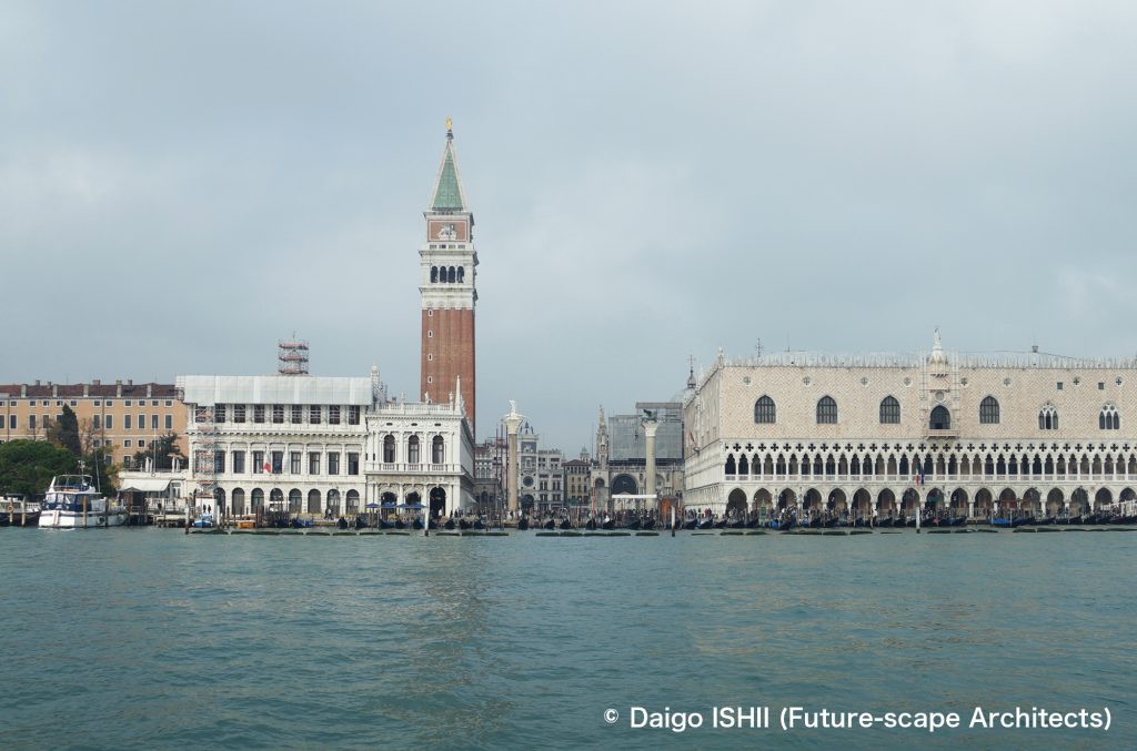
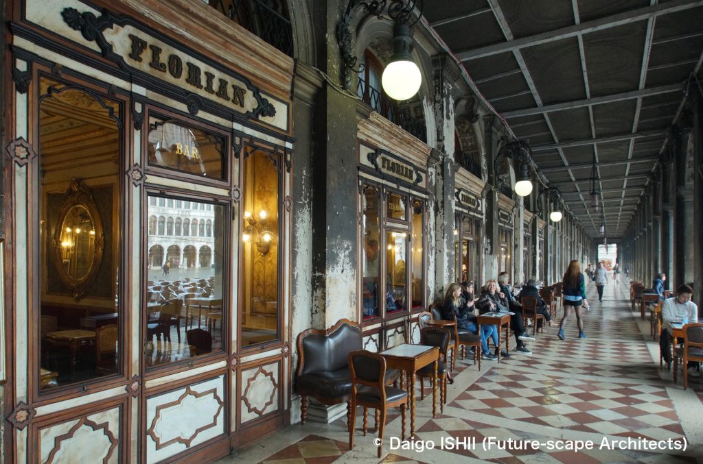
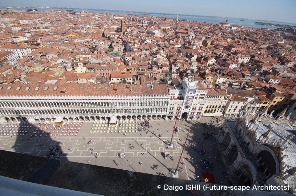
The architect Sansovino's plan for the square and the architectures that surround the square are representative of the Venetian Renaissance, so I am awkward to describe them as "ground." However, he designed them modestly and was conscious of the feature of the place seen from a bird's eye. Its height is lower than that of the Basilica, and the white columns create a quiet white surface by the effect of repeating endlessly. As the result, only Basilica di San Marco comes into view.
Piazza San Marco has a peculiar L-shape, each side facing other side is not parallel, and the axis of Piazza is slightly deviating from Basilica di San Marco. As they walk from the south end, which is open to the sea, to the west end, which columns surround, the change from "opening" to "closing" is generated. Since the view changes like that, the repetition of the columns doesn't look monotonous. Besides, the change in the position to see the bell tower, which was detached from the surrounding architecture by Sansovino and became a freestanding landmark, makes their sense of movement more vivid.
Sansovino, who was conscious of his role as a supporter, was a great architect!
The Renaissance might give birth to an architect who thought of the place in terms of the composition of the whole and the perspective of the people moving within it.
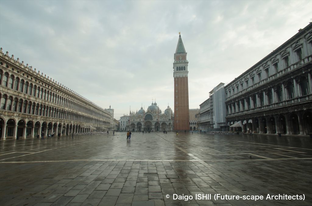
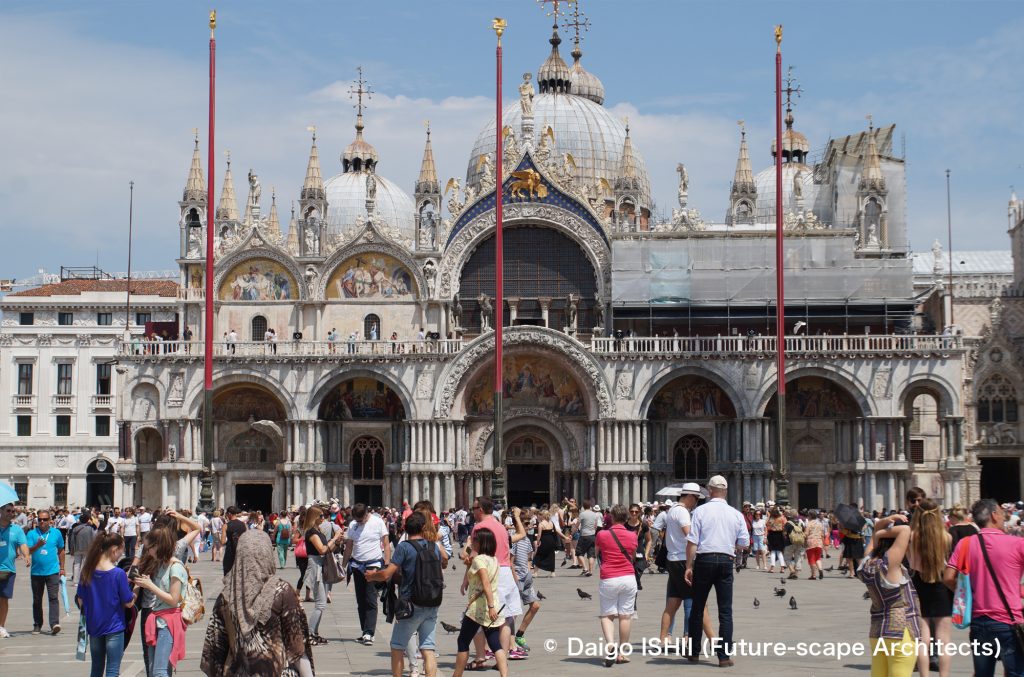
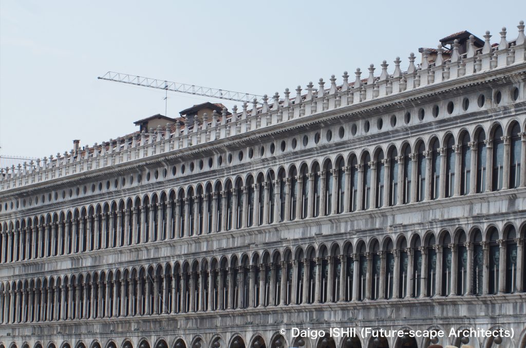
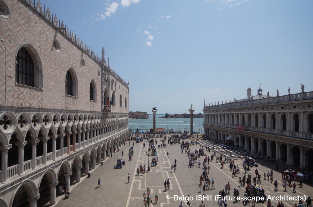
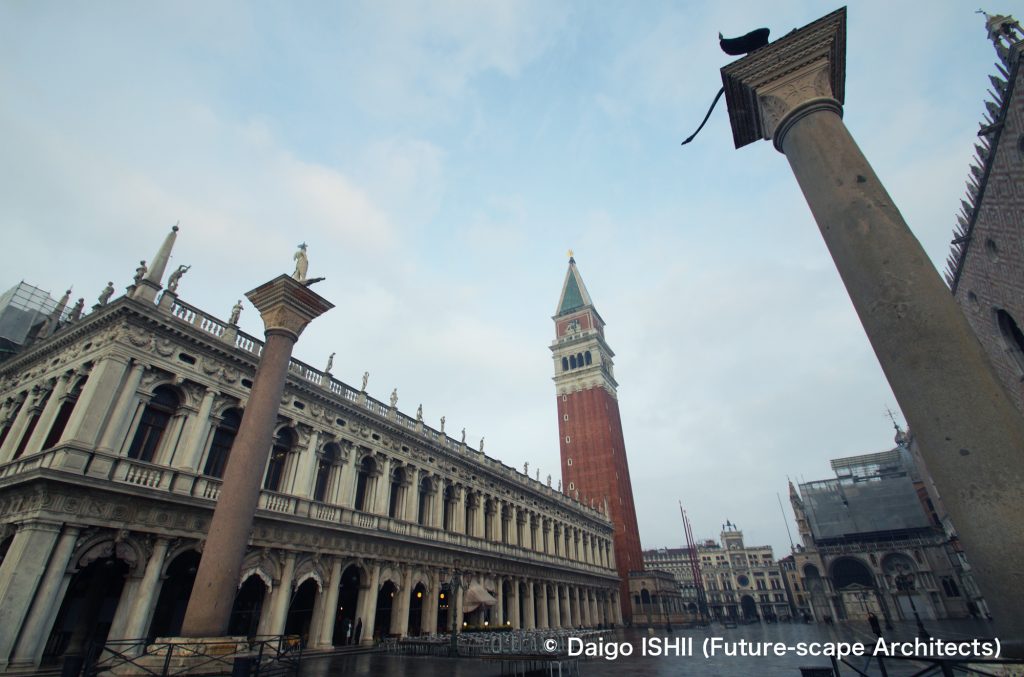
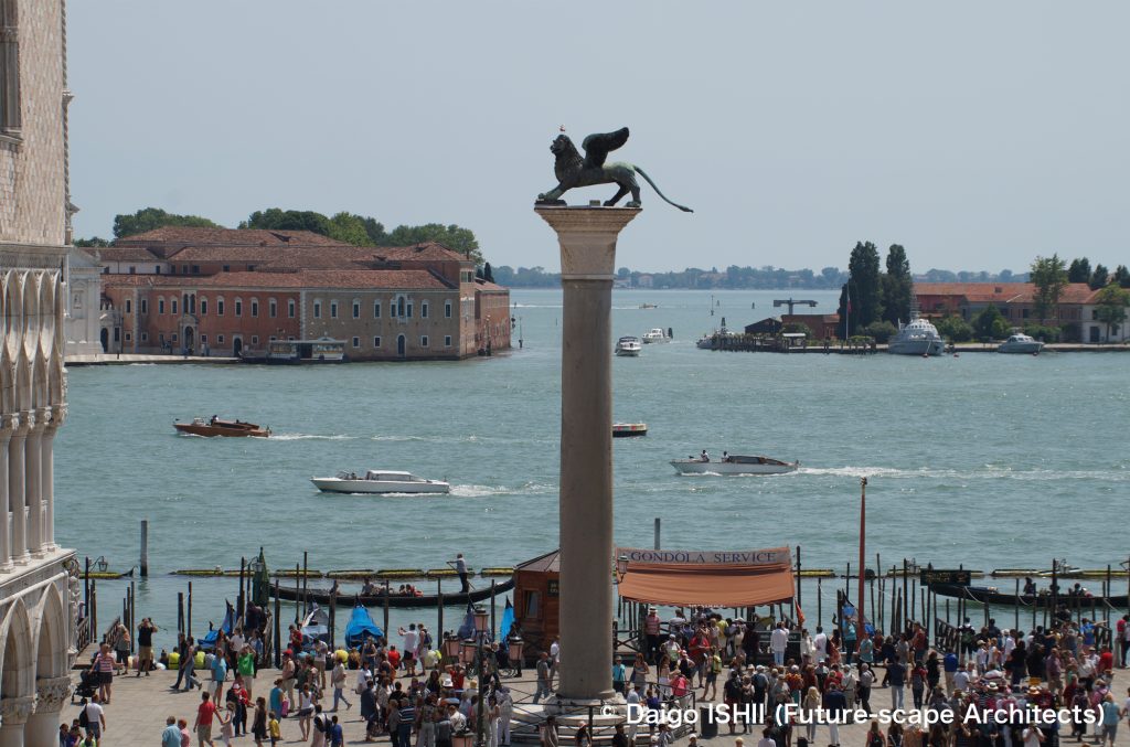
See the corners of the L-shaped square and the bell tower from the south side of Piazza San Marco. On the two columns in the foreground, the Lion of Venice as a symbol of San Marco, the patron saint of Venice, and a statue of San Teodoro, the former patron saint of Venice, are placed.
Click here for your impressions
reference
Wikipedia
Please do not use or upload our photos without permission.
